I'm working on producing some black and white graphics of data which has a lot of overplotting. There are three basic groups, which if I made the plot in ordinary full color ggplot2 would look like this (the code for the reverse-log x-axis is available in this gist, and the code for stat_ellipse() is available in this github repository).
For a black and white image, however, it's trickier. I don't usually find grey color scales to be sufficiently different for a plot like this, so I'd go for different point shapes. Unfortunately, the default shape scale in ggplot2 isn't very distinct in this case.
My first strategy to improve things was to add a custom shape scale, with alternating empty vs solid point shapes.
Better, but not great. All the overplotting of the empty point shapes creates this awful indiscriminate mash in the middle of the clusters.
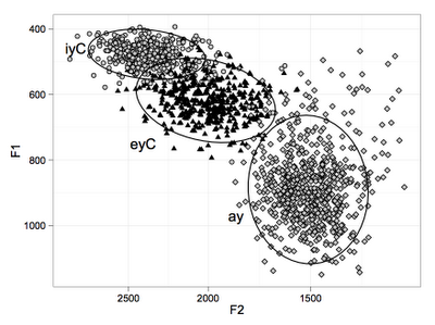
My solution to this problem was to use filled points. While point shapes 1 and 5 in R correspond to an empty circle and an empty diamond, respectively, point shapes 21 and 23 correspond to a filled circle and a filled diamond, respectively, where the fill color and the border color can be different. So, I used shapes 21 and 23 instead of 1 and 5, and set the fill color to be white.
I think it's a big improvement. Here's one more iteration, filling the points with a light grey shade instead of white, just for some aesthetic appeal.


No comments:
Post a Comment